UP FOR THE CHALLENGE

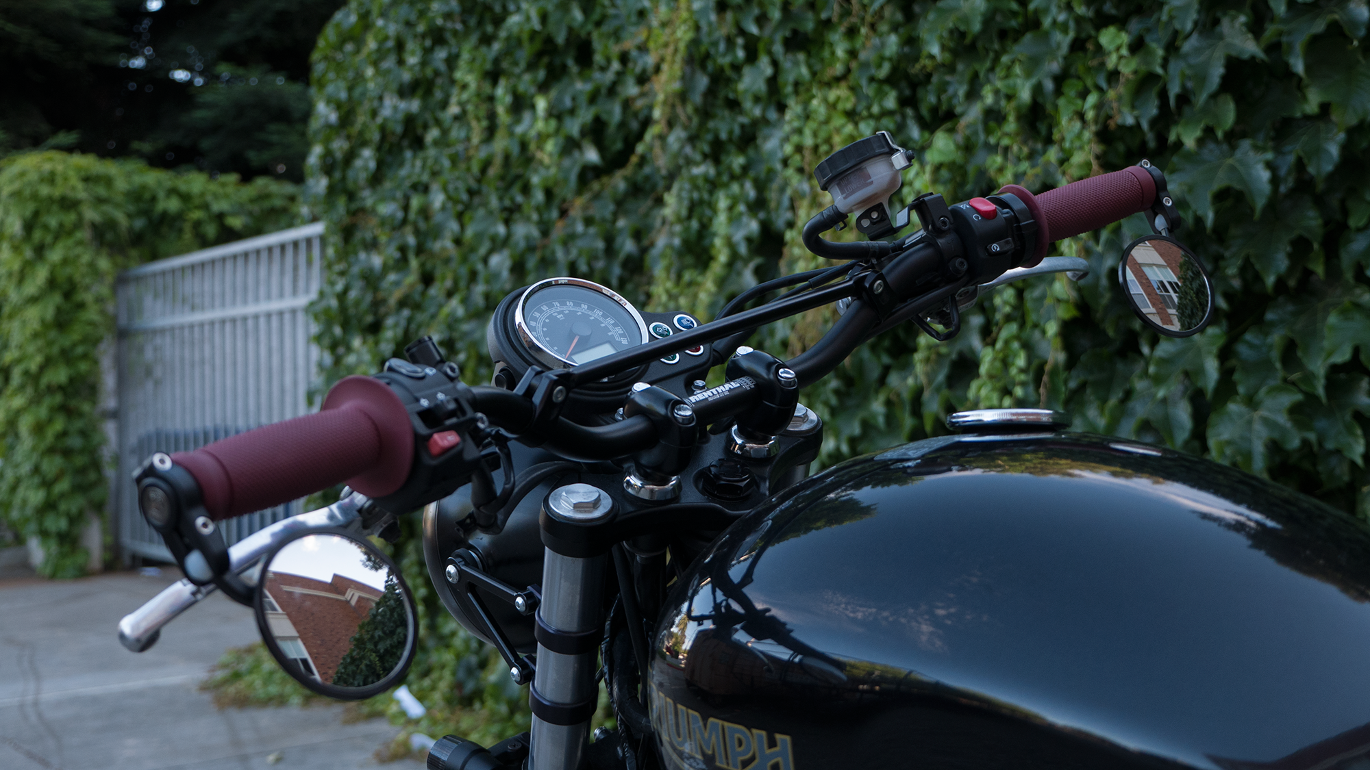
I've had my eye on the Scrambler Solo Seat for awhile now. I wanted it for the rear rack so I can motorcycle camp this summer. After months of monitoring craigslist I finally found a great deal. I wanted a used seat so I could learn to reupholster it. I don't know much about upholstery but figured I'm up for the challenge. The thought of having a custom motorcycle seat seems rad. It'll definitely set my bike apart, and make the value go up right...? (joke about the latter)

It was a difficult decision because I was torn between making the seat black pleats or burgundy pleats. I've always been a fan of the blacked out look, but I'm glad I went with the burgundy (some call it oxblood.) I'm quite happy with the new seat and grip combo. What are your thoughts?

Don't be fooled by the video. I failed twice. This was the third try. Here is my first attempt:

Anyway. enjoy the video and photos of the new look. 

PS. I got rid of the hideous stock rear fender. Replaced it with the Motobox Slimline. I think it makes the tail-end so SICK! Get yours here.

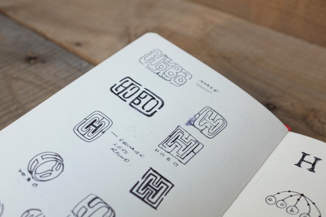
Forming the Mark: Ho°Bo°

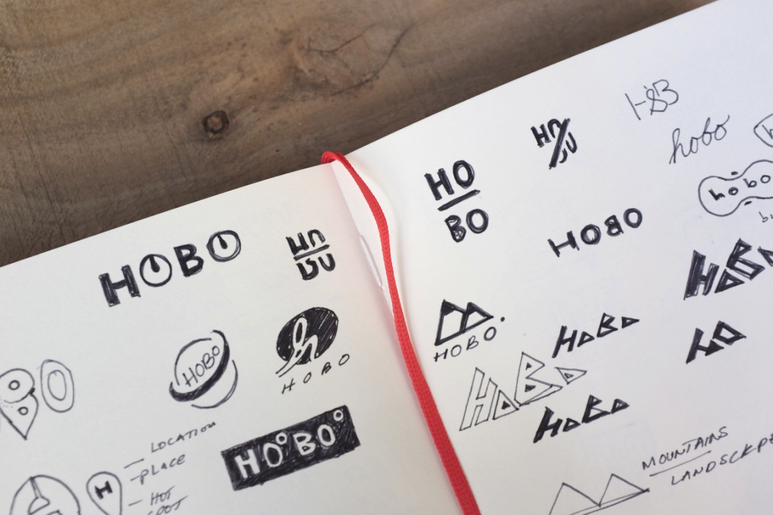
hobolife_logoexploration_page1.jpg

If there is one thing I can pass along on this post, it's a theory I call the "appleswoosh" effect. Its when a companys logomark doesnt directly correlate to the things they produce. Its more about their products, core values and beliefs that make their icon, an icon. Nike used a checkmark. Apple, a fruit. My point is -- is that sometimes we spend too much time justifying our logo designs, and dont realize its only a third of the equation. This isn't very conducive to any forward momentum of our company. 

hobo_diagram_appleswoosh_diagram2.jpg

In the diagram above there are three pillars that make up a company: The Icon, Brand & Product. I’ve represented them through sketches we can relate to. The icon is the face of the company. Regardless of how attractive you are, we rely on the heart to determine your brand.  These are things such as: your attitude, personality and values. The sum of it all is what society consumes, the product

As much as I am excited to fill this blog with product. Firstly, it'll be fun to touch on the logo I designed and the inspiration around it. Yes, it's ironic I encouraged you to not spend much time on your logo, but you should still care about its origins.  Keep good design practices, but avoid spending way too much time justifying the design so you don't rabbit hole yourself and move on.

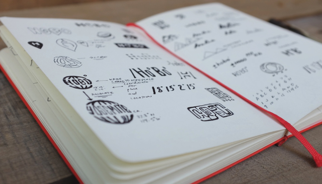
I knew I wanted this blog to be about adventures on the motorcycle. There are so many places I want to check out, in and around California. Ho°Bo° is the perfect excuse to ride and explore. When designing the logo I drew inspiration from things related to: location, geography and traveling. I chose the final logo because how extensible the longitude & latitude concept is, and I love its application. Imagine Ho° & Bo° replaced with coordinates relative to my adventures. Would you be curious about where I went? There's something compelling about tracking down mysterious coordinates to me that I encourage the stalker in you to agree. Especially if I presented them to you like this:

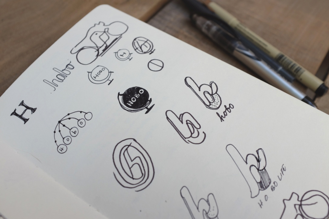
Below are a few more sketches to tease your appetite. Enjoy them as I enjoyed quickly sketching them.